

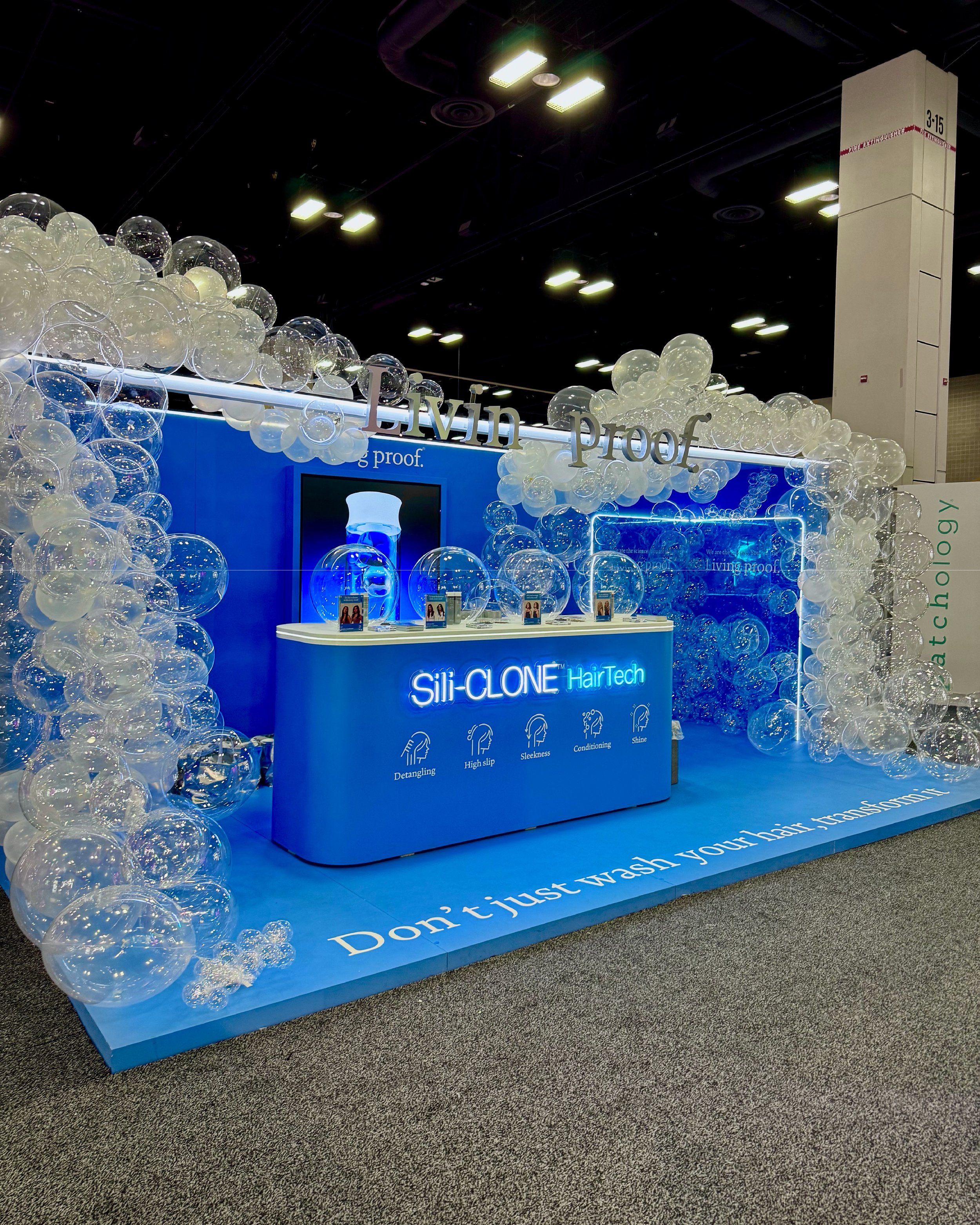
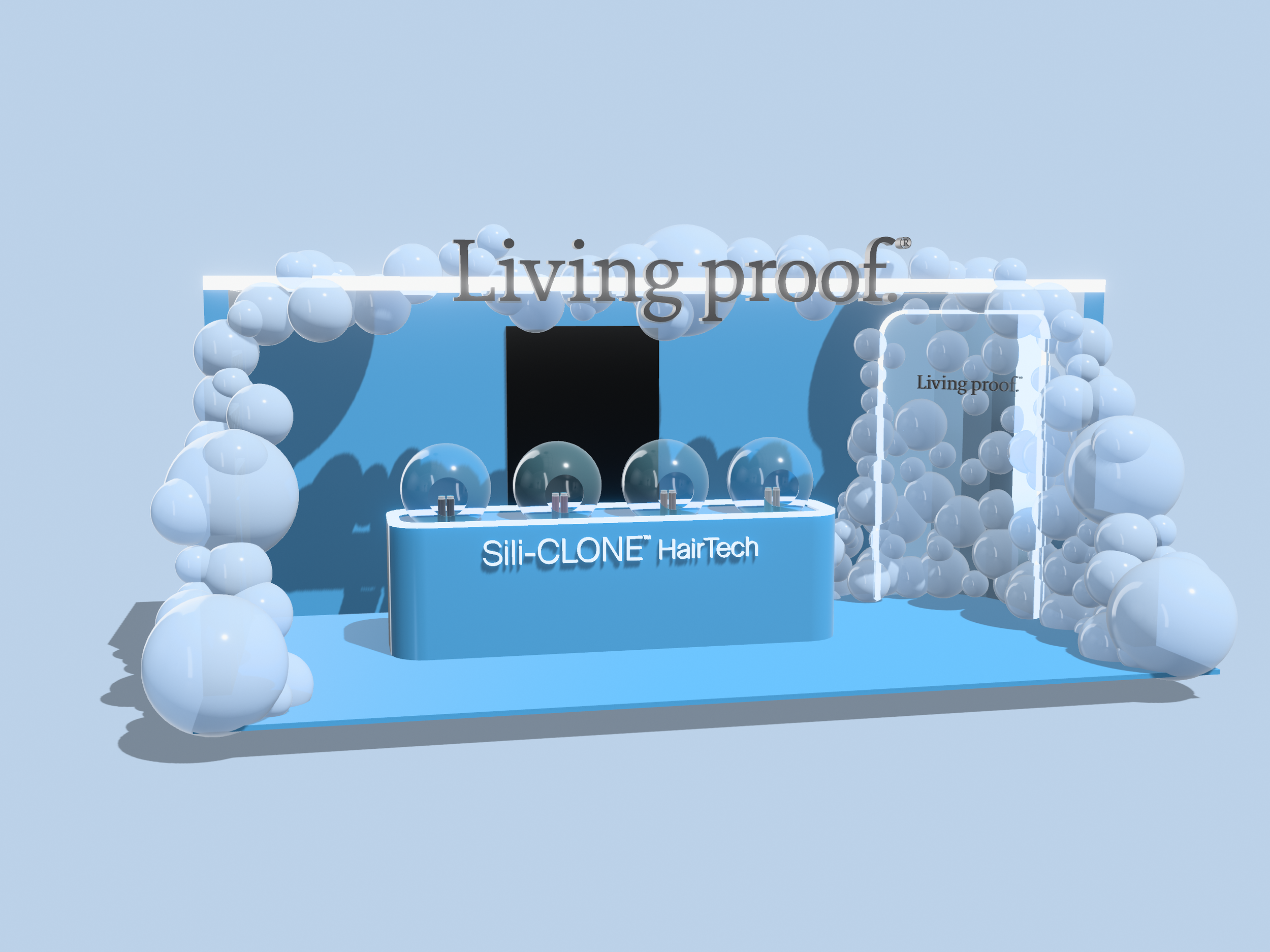
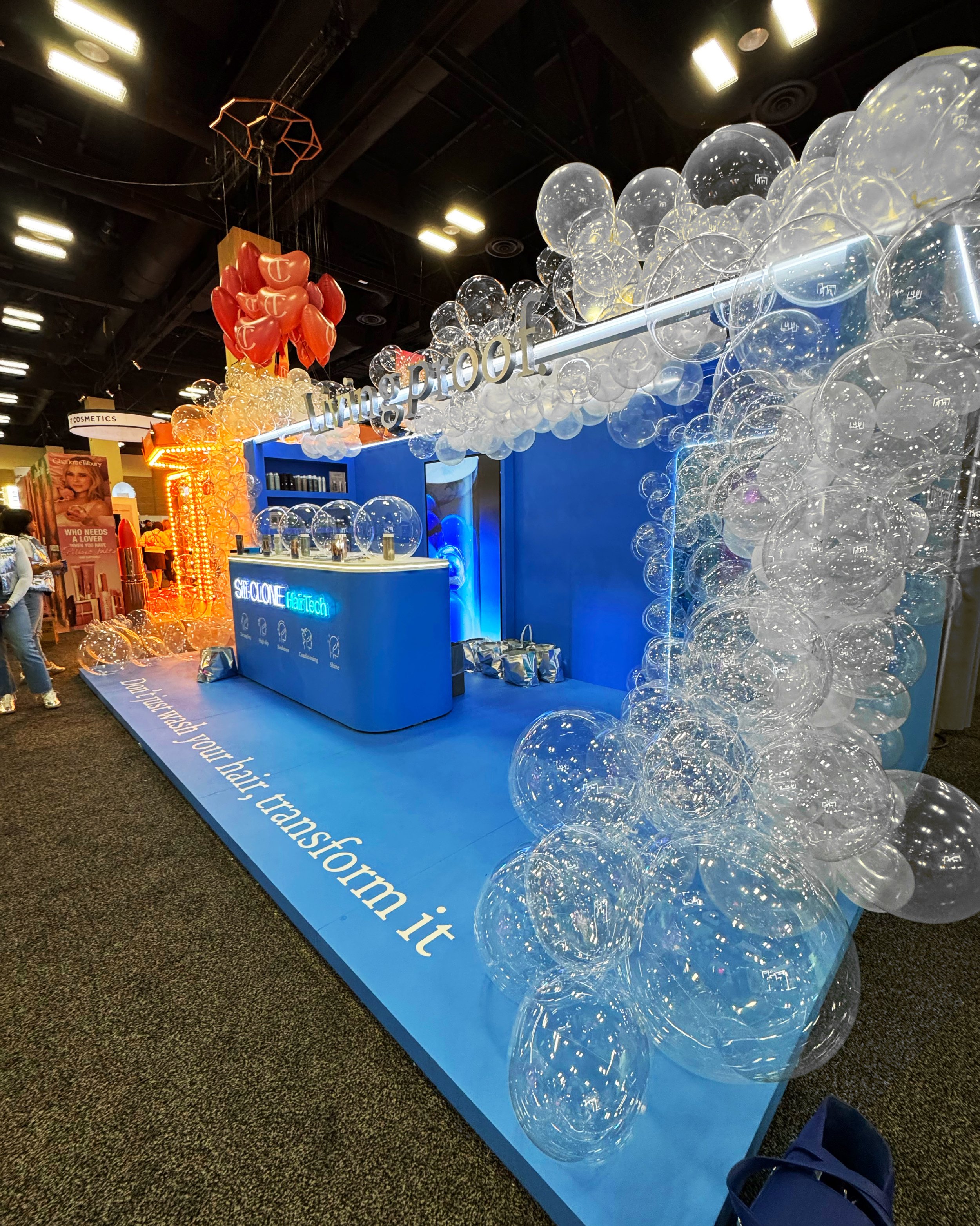
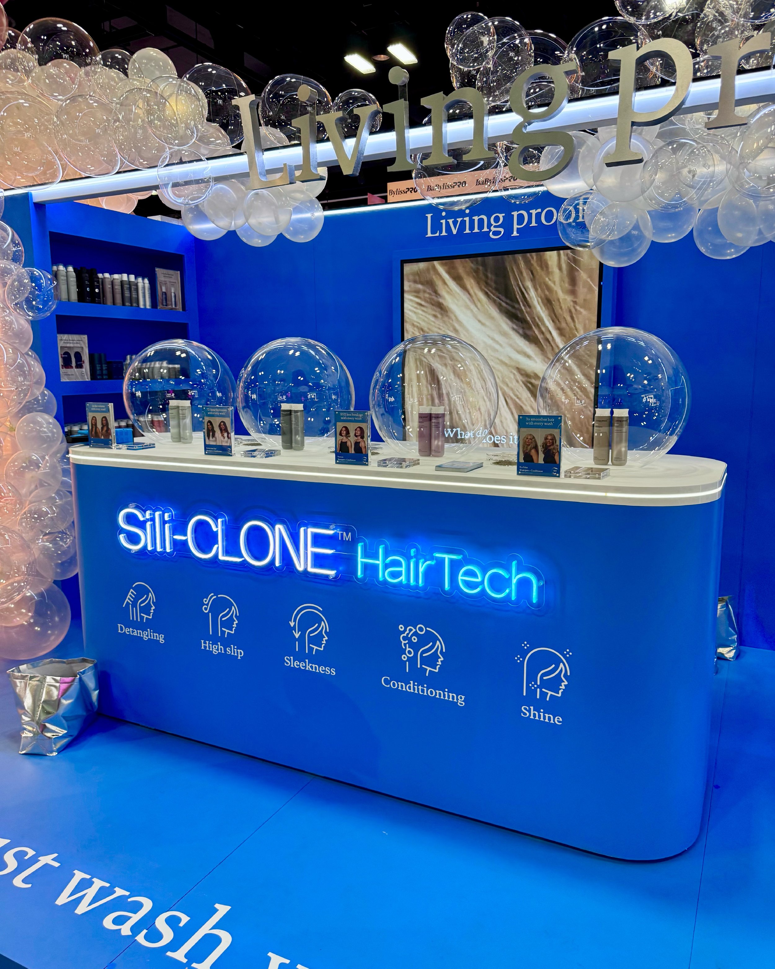
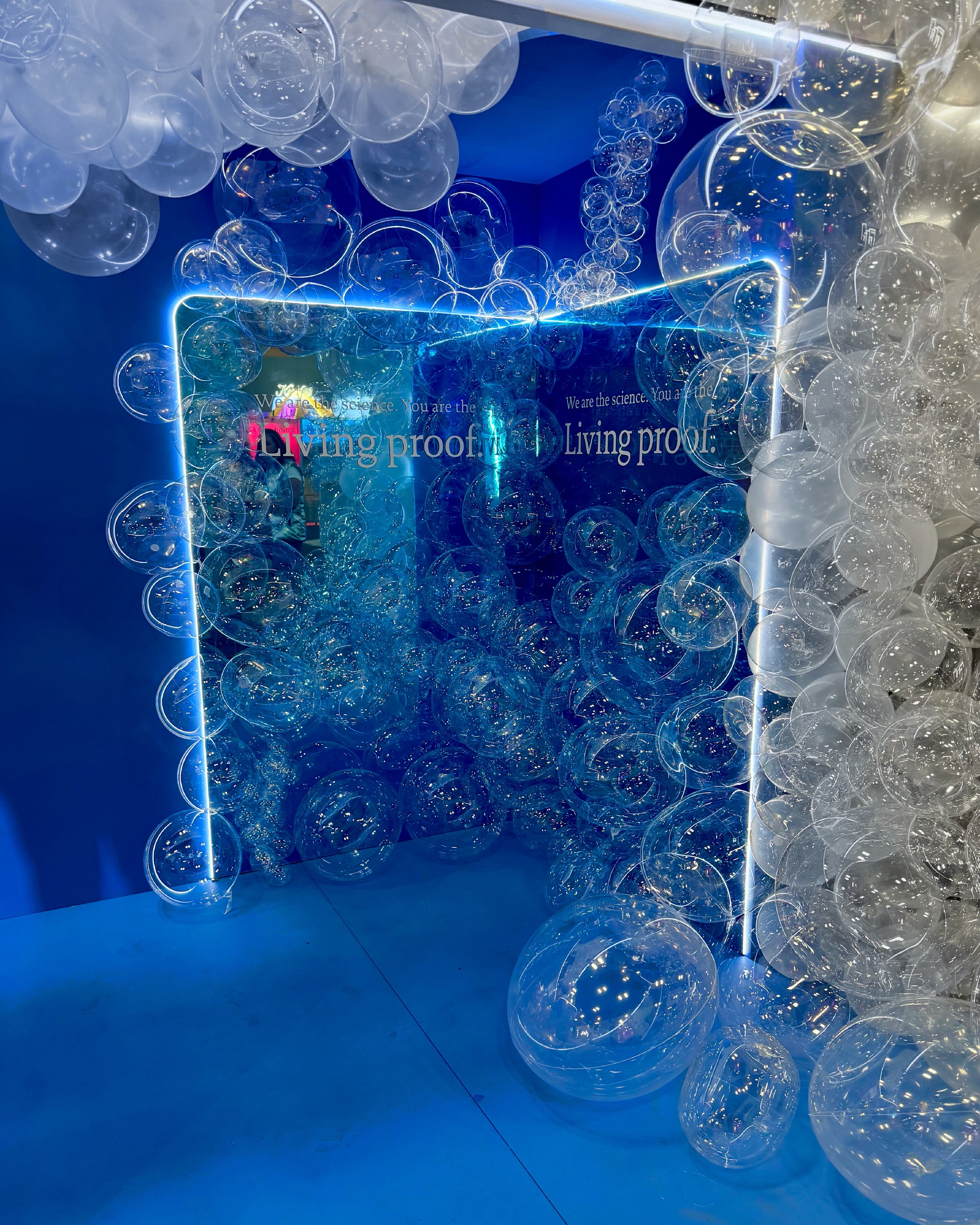
Living Proof, FLC 2025 Booth.
Living Proof had several priorities on this project, but their main focus was their Sili-Clone™ Technology across all product lines. The booth plays off of some of their more well known creative work around the technology, incorporating the signature blue, bubbles, and a clean information hierarchy for booth visitors. You walk up and know this is Living Proof with color, large logo, and a compelling novelty, bubbles. I created a light halo around the top of the space, and we focused our information on Brand, Technology, Franchise, Details in that order, working big to small as one would learning new information. Both the clients and the LP team was wowed by this design, and I am quite proud of the work we were able to create on such a truncated schedule.

Living Proof, Visual Merchandising Overhaul.
Living Proof was looking for a quick and relatively inexpensive overhaul for their units in Sephora and came to me for a solution. I designed into the vibe and ethos of the brand, extracting key elements from the LP world in which we were able to translate their key pewter metallic accent into the front strips on the unit. I also developed a channel system for the graphics in a myriad of simple yet elegant shapes for easy display of both key messaging and product information. This enabled future updates to be made tastefully with minimal cost and a significant material reduction by focusing on lighter thinner materials that utilized this channel.


